timeline
role
deliverables
links
User Research, User Testing, Product Design, Circular Economy Design System, UX Design, Prototypes
Project Book (to come)
Product Designer
UX/UI Designer
Aug 2022 - Dec 2022
the problem
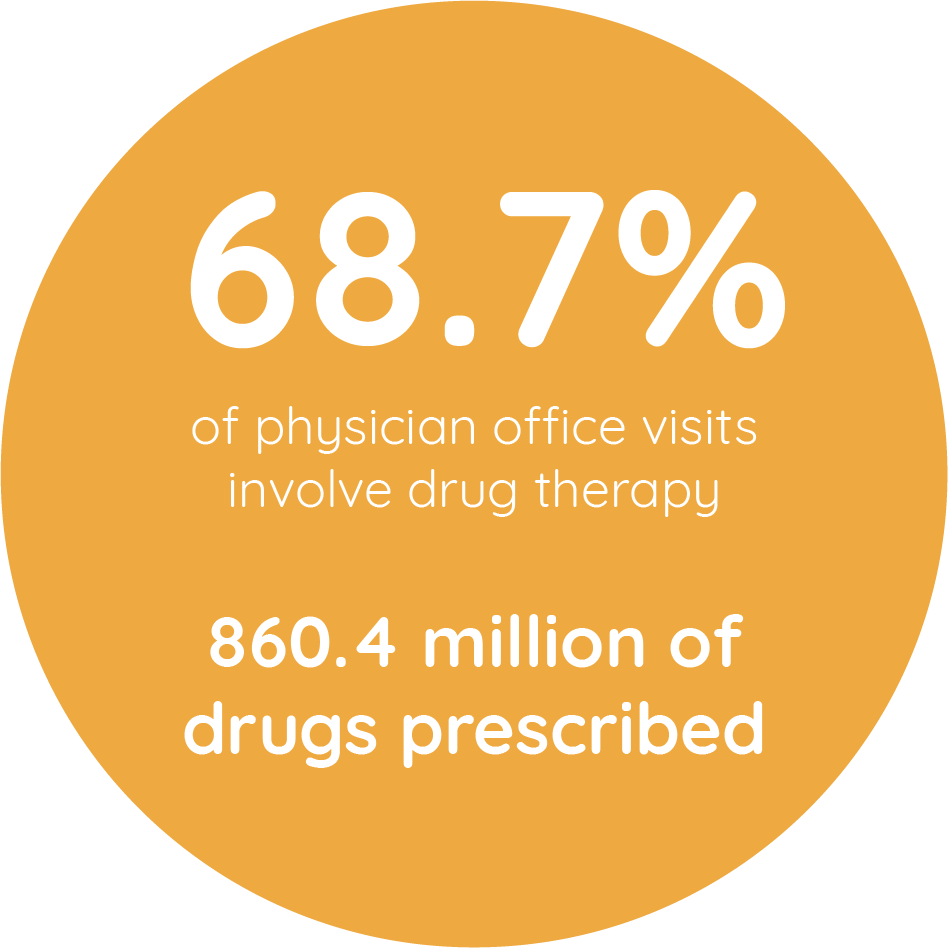
Traditional prescription pill bottles present significant usability challenges for patients, often leading to medication errors such as missed doses or incorrect pill intake. These issues stem from unclear labeling, hard-to-open caps, and inefficient design, which can be especially problematic for elderly or disabled individuals. Furthermore, the widespread reliance on single-use plastic bottles contributes to environmental waste, with millions of bottles ending up in landfills every year, exacerbating the global plastic pollution crisis.
the solution
The core of the solution is a mobile app designed to improve the overall user experience of medication management. The app offers intuitive features for tracking prescriptions, setting reminders, and managing dosages, helping patients take their medication accurately and on time. It also integrates a streamlined system for returning used pill bottles to pharmacies, promoting sustainability. To complement the app, redesigned pill bottles feature clearer labeling and ergonomic designs, making them easier to use. Together, the app and bottle redesign aim to provide a safer, more efficient, and environmentally conscious approach to managing prescriptions.
research
Prescription medicine bottles, crucial in daily life, present a recycling challenge. Despite being made of recyclable polypropylene, their small, round shape stumps traditional recycling methods.


Current prescription bottle labels often prioritize less critical information, overshadowing vital details like dosage instructions and warnings. The fonts used can be hard to read, highlighting the need for a redesign focused on clarity and prioritization to enhance patient comprehension and safety.
target user groups
Senior Citizens

Senior citizens are a big group of consumers and often have more than one prescription.
Some conditions to consider include, weaker grip, memory loss and eyesight loss.

Caregivers
Caregivers are in charge of their patients prescriptions. Can be professional nurses or family members.
They can have more than one patient, and need an organized system to avoid mix ups.
Schedule-Based User

There are consumers from different ages that require specific prescriptions on a daily basis.
It can be hard to track daily doses or dosage time with busy, changing schedules.
user persona

I developed three personas, each representing one of the target user groups: senior citizens, caregivers, and schedule-based users. For this project, I chose to focus on the senior citizen persona, as this group faces the most significant challenges with current prescription tracking apps. Seniors often encounter usability barriers due to visual impairments, complex app navigation, and difficulties setting flexible reminders. By prioritizing their needs, I aimed to design a more accessible and user-friendly solution that can improve medication management and safety for this vulnerable group.
1
pain points
2
Small Text & Buttons
Many apps have small fonts and buttons, making it difficult for seniors with visual impairments to read and navigate.
Complex Navigation
Cluttered or confusing interfaces can overwhelm older users, leading to frustration and errors in tracking their medication.
3
Rigid Reminder Systems
Existing apps often lack flexibility, making it hard for seniors to set reminders that fit their daily routines, resulting in missed doses.
4
Limited Progress Tracking
Many apps fail to provide a clear overview of medication adherence, which could help seniors stay consistent and motivated in managing their prescriptions.
wireframes


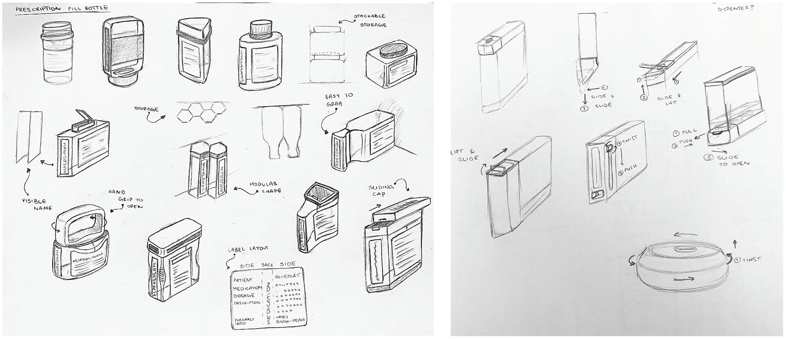
design considerations
Size
Make bottle bigger so that it can be recycled, if thrown away
Information Layout
Redesign information layout, think about information priorities
Cleaning
Shape needs to be easy to clean, in order to be reused
Ergonomics
Current shape is too small to hold, uncomfortable for user. Difficult to open. Think about storage.
Color
Maintain orange color to protect medicine inside from UV rays
return service system

Current Linear Economy Diagram

New Circular Economy Diagram
market analysis

ideation sketches